How to use R to do a comparison plot of two or more continuous dependent variables
Step 1: Format the data
Put the data below in a file called data.txt and separate each column by a tab character (\t). X is the independent variable and Y1 and Y2 are two dependent variables. Each row is an observation for a particular level of the independent variable.
Another method that works is to select the data below, copy it, paste it into an editor, and then save the file as data.txt (this has been verified to work with Firefox 7.0.1, Notepad in Windows 7, and R version 2.11.1).
0.1 0.05 0.36
0.2 0.06 0.46
0.3 0.08 0.53
0.4 0.08 0.64
0.5 0.11 0.70
0.6 0.16 0.73
0.7 0.28 0.81
0.8 0.56 0.88
0.9 0.81 0.93
1.0 0.92 0.92
Step 2: Load the data
First we need to load the data into R. A convenient way of handling data in R is to use a data table. The statement below creates a data table d from the file data.txt. The directive header=T tells R that the first row contains variable names rather than measurements.
Step 3: Construct a plot
![]()
Empty plot without data
The first thing we need to do is to set up a plot. The figure to the right shows how this initial plot will look like. As is evident in the figure, the plot does not show any data yet.
To set up a plot for our scenario we need to give the R plot function several directions.
First, we have to tell R to plot something so we provide R with the following expression: d$Y1~d$X. It tells R to plot the Y1 variable as a function of the X variable from a data table named d.
Second, we prevent R from providing automatic annotation of axes by giving it the direction ann=FALSE. We also prevent R from actually plotting anything by giving it yet another direction: type="n".
Third, we have to set the limits of the x and y axes so that we can ensure the plot is large enough to capture all measurements for all dependent variables we wish to include on the plot. In our case, reasonable limits are 0.1-1.0 for the x axis and 0.0-1.0 for the y axis. Hence we give R the following directions: xlim=c(0.1,1) and ylim=c(0,1).
A statement that provides R with all these plot directions is the following.
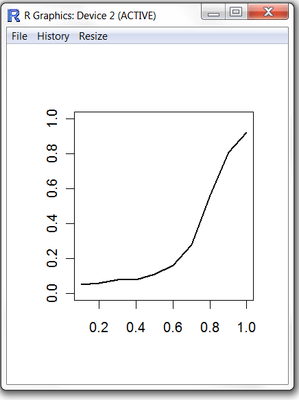
Step 4: Plot the first variable as connected solid lines
After adding a single variable
Once we have set up an initial empty plot we want to start plotting actual data. The strategy is to plot each dependent variable in turn. We will start with the Y1 dependent variable.
The below statement draws lines connecting the data points for the first variable using a line width of two.
The result is the single dependent variable Y1 being plotted as a function of the independent variable X1. A figure to the left shows the result.
Step 5: Add title and axes information
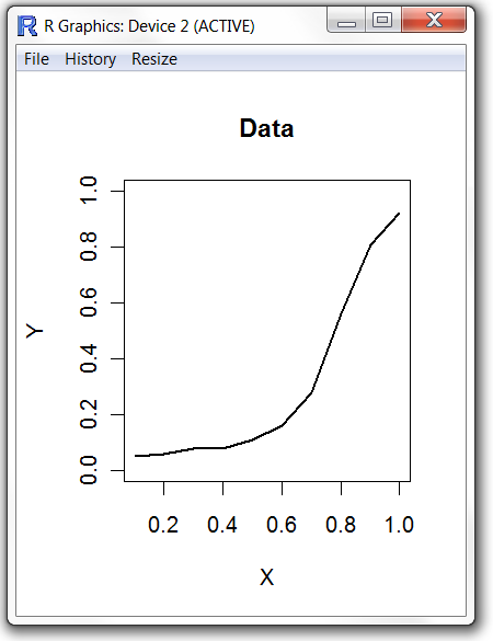
After labelling the axes
Typically we want to label the axes so it is easy for a reader to understand what type of data is being plotted. It is also often useful to add a title for the plot, particularly if the plot is going to be subpanel in a larger set of figures.
You use the R title function to add a title and label the axes. The syntax is self-explanatory.
The figure to the right shows the result.
Step 6: Adjust the plot size
Use your mouse to resize the plot window so that the proportions are appropriate for your paper.
Step 7: Plot the second variable as connected dashed lines
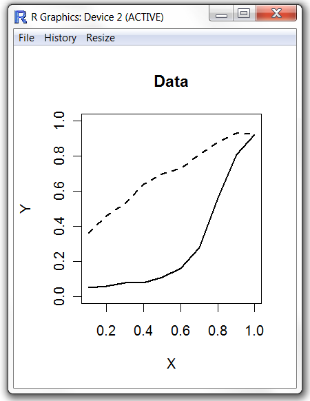
After adding the second variable
Now all that is left to do is to plot the second dependent variable. When you plot the second variable ensure you keep the existing plot window open.
The statement below draws dashed lines connecting the data points for the second variable using a line width of two.
The figure to the left shows the final result.
Step 8: Save the plot
To save the plot go to the File menu and choose Save as. If you use pdflatex saving the plot as a PDF allows it to be conveniently included in your Latex document.
Summary
To plot two dependent variables as functions of a single independent variable you execute the following commands.
plot(d$Y1~d$X,ann=FALSE,type="n",xlim=c(0.1,1),ylim=c(0,1))
lines(d$Y1~d$X,lwd=2)
lines(d$Y2~d$X,lwd=2,lty=2)
title("Data",xlab="X",ylab="Y")